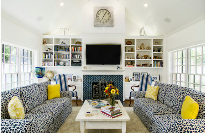
13 Visual Tricks Home Stagers Are Playing on You
In today’s ultracompetitive real estate market, it’s said that potential buyers make up their minds within seconds of stepping inside a home. That’s why an ever-growing number of sellers turn to professional home stagers—whose services, some say, can add instant appeal and even sell a house up to 40 days faster.
Their secret? An arsenal of optical illusions and psychological tricks that draw buyers’ eyes to all the right places. Yep, that’s right. Home stagers are fooling us! (And we love it). Here are some of the secrets of the dark art.
1. They never leave a room empty
Any home seller’s top goal is to make a small space look bigger. (Serious about selling? Here’s how to find a real estate agent in your area.) To get that look, you might be tempted to empty out the space and remove all your bulky furniture. But there’s a twist: Emptiness can actually make rooms look smaller.
Instead, professional stagers manipulate your visual perception of a room through the use of the right kind of furniture, says psychologist Kristie Barnett, author of “Psychological Staging: The Home Staging Secrets of the Decorologist.”
“An empty room gives buyers no point of reference for size,” Barnett says. “I have seen many buyers walk away from a vacant home because they falsely believe their own furniture will not fit in the master bedroom or that the living room will not provide enough seating for entertaining. Staging rooms with furniture helps establish the room’s size and helps a buyer visualize how they can arrange their own furniture.”
2. They really think about furniture placement
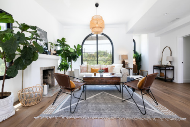
Photo by Texture Living Inc
“We scan a room from left to right upon entry,” Barnett says. “If you place the tallest piece of furniture in the room in the far left corner, the room will appear larger.”
Placing a large or tall piece of furniture on either side of an entryway or door makes a room appear smaller, according to Barnett, while placing such pieces farther back in a room makes the space appear larger.
3. They use the ‘Rule of Three’
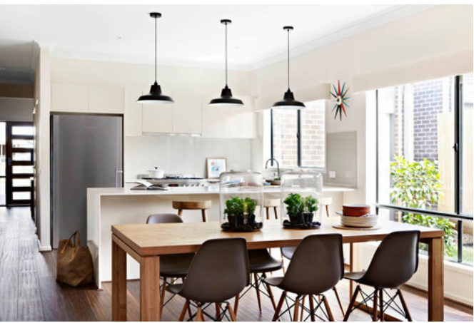
Photo by Arkee Creative
Interior designers swear by this golden rule of home staging, which involves grouping items—from chairs to lighting to artwork and accessories—in threes (or fives or sevens or nines).
According to Whitney Parrott, lead designer at Everything Creative Designs in San Diego, arranging items in odd numbers forces the eye to move around a space and makes the overall experience more natural and visually rich (compared with the forced feeling you might get from even numbers).
4. They highlight focal points
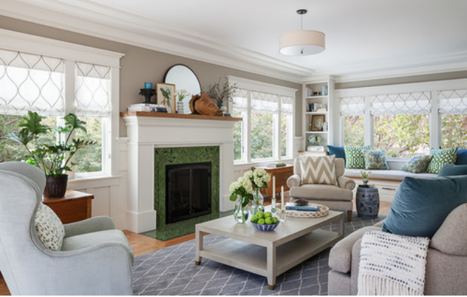
Photo by Sogno Design Group
Walk into any well-staged home, and you’ll notice great accent accessories positioned near a room’s best attributes. For example, a grouping of (three!) vases near a gorgeous fireplace or a large plant near a window with a view. Stagers also frequently position furniture at an angle to facilitate better movement in a square or skinny room, or to highlight existing focal points.
5. They create cozy conversation spaces
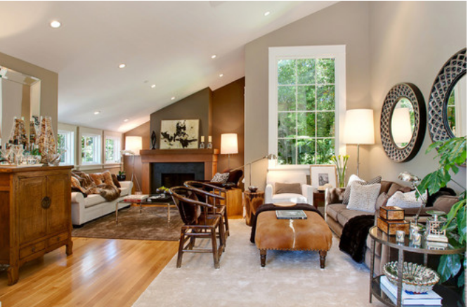
Photo by Urrutia Design
Prospective buyers want to socialize in a home’s common areas without moving chairs. Plus, placing furniture in conversational groups (think a love seat and two chairs) makes rooms feel larger.
In long rooms, consider creating two separate chat areas and delineating them with area rugs to create the illusion of more space. (Pro tip: Using just one rug that’s too large actually makes a room look smaller.) The back of a couch can also be a great divider between rooms in an open floor plan.
6. They don’t overdo it with rugs
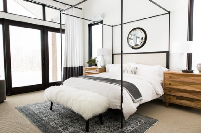
Photo by Studio McGee
“Unbroken floor space makes any room appear larger, which is why I recommend removing most rugs (except to anchor a conversation area), bed skirts, and items off the floor of closets,” Barnett says. She likes using furniture with long legs to further the effect.
7. They use consistent color to make rooms flow
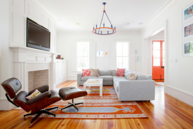
Photo by Margaret Wright Photography
Weaving the same pops of color throughout your home allows your space to flow cohesively from one room to the next, according to Parrott. Incorporate similar hues across rooms in pillows, artwork, and accessories. Generally, stagers recommend dedicating 60% of a room’s space to a single color, 30% to a secondary color, and 10% to an accent.
8. They let mirrors create the illusion of space
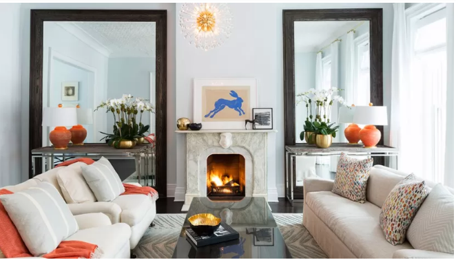
Photo by Chango & Co via Houzz
Designers universally agree that mirrors make small rooms appear bigger by reflecting light. According to Canadian stager Martha Stanton-Smith, when a buyer catches a glimpse of himself in a mirror, “he will literally see himself in the house. The subliminal suggestion will tell him he has a connection.”
9. They never underestimate the power of a well-placed curtain rod
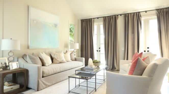
Photo by Motus Films
Hanging curtain rods just below the ceiling (as opposed to above the window) adds the illusion of height to an otherwise average-size room.
10. They find a style that works—and stick to it
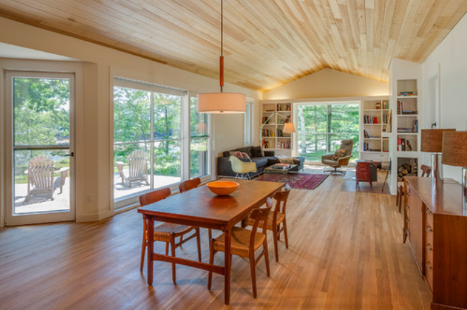
Photo by GO LOGIC
Consistency in furniture style provides a sense of continuity and calm that prospective buyers expect and will remember.
“If the living room is contemporary, the rest of the home should also be a contemporary style,” Parrott says. “Don’t hop from contemporary to traditional to eclectic. Stick with one.”
11. They skip the dresser
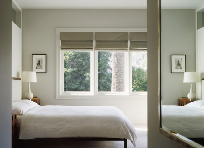
Photo by Schwartz and Architecture
Remember, the objective of staging is generally to make each space look larger. That’s why stagers never include dressers and other “arbitrary” furniture, unless they’re working with a very large space. (If you need a place to stash your duds, consider renting a storage unit or organizing nonessential items in clear plastic bins in a closet or garage.)
12. They stash the TV
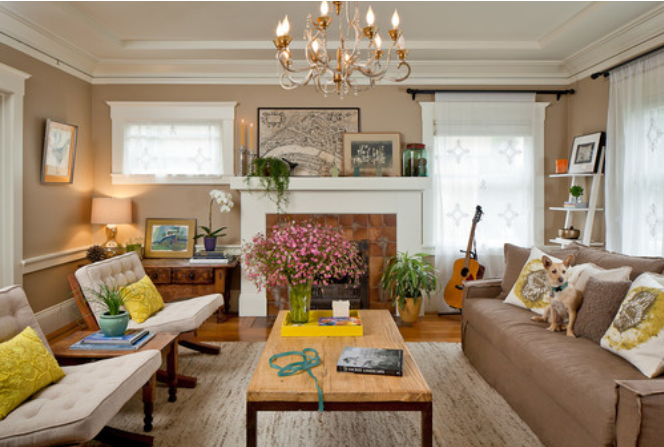
Photo by bleu leman design
Most professionally staged homes ditch television sets, which can occupy valuable wall space and often make rooms appear smaller. If you’re living in your staged home, consider using a laptop or iPad for those Netflix binge sessions. The caveat? If your set is flat-screen, appropriately sized, and wall-mounted, it can stay—just as long as it’s in common living areas and out of bedrooms.
13. They let the light in
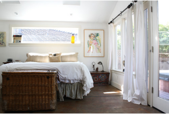
Photo by Shannon Malone
Ample lighting adds what pros call “visual square footage”—the illusion of more space. All windows should be thoroughly cleaned to let the light in. Then, swap out heavy, room-darkening drapes or heavy blinds for opaque, light-filtering window treatments or light curtains. Use wall sconces, floor lamps, and task lighting to add more wattage on the cheap.
While these tips might seem overwhelming to design rookies, you don’t really need a degree in psychology to sniff them out—or to use them in your own space.
“At its core, staging is all about creating high-impact vignettes to distract the eye,” Parrott says. “When in doubt, remember this: Less is always more.”


